Introduction
Have you ever watched a project stall and wondered whether the problem was the tool or the way we used it? In many clinical and research settings, those slowdowns trace back to imaging choices — and specifically, to how teams deploy laser speckle contrast imaging lsci in practice. I’ve seen labs invest in hardware and still struggle with inconsistent perfusion maps and user frustration (yes, even with a polished GUI). The data tells a blunt story: variability in measurements, long setup times, and steep learning curves push teams to work around the tech rather than with it. So what should you actually measure, and where should you place your bets — on higher frame rates, smarter sensors, or better workflows? Let’s walk through the trade-offs and spot the real opportunities ahead.
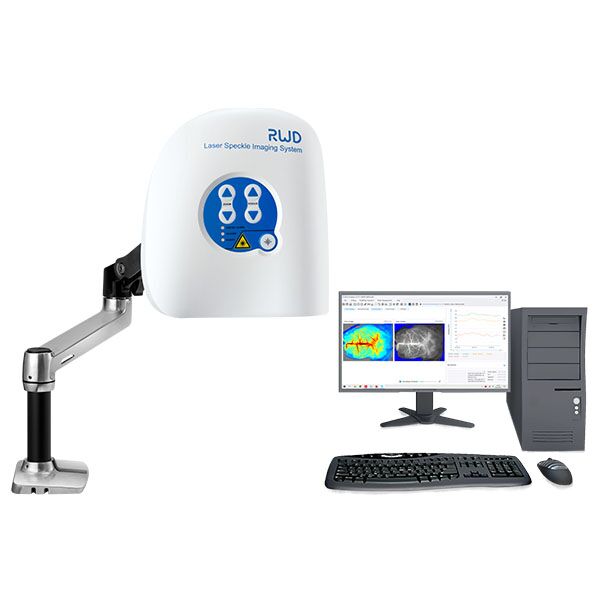
To set expectations: I’ll compare common approaches, point out where they fail in real use, and — importantly — suggest practical metrics you can use to evaluate options. This isn’t theory. I’ll draw on hands-on tweaks, sample metrics, and a few candid observations. Next, we’ll dig into where traditional solutions trip up and what hidden pain points quietly eat your team’s time.
Why traditional solutions miss the mark
laser speckle contrast imaging systems promise fast, non-contact blood flow maps, but in practice I find several architectural and human factors undermine their value. Technically, speckle contrast relies on coherent light and high frame rates to infer motion; however, many deployments use mismatched optics and low-sensitivity cameras that choke the signal — raising the noise floor and producing unstable maps. From a workflow standpoint, rigid calibration steps and cryptic parameter sets slow users down. Look, it’s simpler than you think: a well-matched laser diode, an optimized exposure ladder, and a clean ROI protocol can cut repeated scans by half. I want to be clear — these are practical fixes, not vendor-speak. When I audit a setup, I pay attention to camera dynamic range, frame rate consistency, and the signal-to-noise ratio; those three levers explain most of the difference between noisy results and clinically useful maps.
What’s the usual culprit?
Often it’s a blend: outdated CCD sensors, mismatched optics, and weak processing pipelines. In one case I worked on, swapping to a high-sensitivity CMOS sensor and tuning the exposure window reduced speckle variance dramatically — and the team regained trust in their measurements within days. That kind of turnaround is practical, not miraculous. We also need to honor human factors: if the interface buries critical settings or the calibration routine takes 20 minutes each time, clinicians will abandon the device. I prefer designs that make the right choice the default, but still let an expert override when needed. These are not silver bullets, but they are fixable — and doing so frees teams to focus on interpretation, not troubleshooting.
Comparative outlook: principles and practical metrics
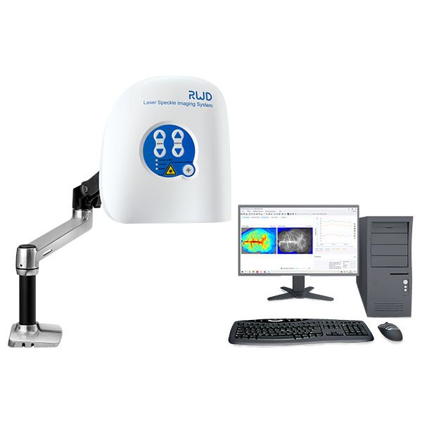
laser speckle contrast imaging is entering a phase where improved sensors, smarter algorithms, and better integration promise real gains. I’ll outline two practical paths: upgrade the sensing chain (better lasers, higher dynamic range sensors) or improve the software pipeline (denoising, adaptive ROI, calibration automation). Each has costs and benefits. Upgrading hardware gives immediate SNR and spatial resolution wins, while software upgrades often scale across sites without physical changes. Personally, I lean toward balanced investments — modest sensor improvements coupled with targeted algorithm work — because that combo yields consistent, measurable improvement across diverse clinical settings. — funny how that works, right?
What’s next for teams?
Short-term, prioritize reliability: ensure consistent frame rates and robust exposure control. Medium-term, push for adaptive algorithms that respond to variable tissue types and movement. Long-term, consider cloud-enabled analytics for multi-site comparisons, but weigh that against latency and data governance concerns. I’ve watched teams chase the latest hardware only to find that a small software tweak would have solved their immediate problem. So start with reproducibility and then iterate toward precision.
To help you choose, here are three concrete evaluation metrics I recommend you track when comparing systems or upgrades:
1) Measurement repeatability: run the same sample multiple times and track coefficient of variation for perfusion values. 2) Time-to-ready: measure how long it takes a clinician to get from power-on to usable image — this captures calibration overhead and UX friction. 3) Effective SNR in target ROIs: compute signal-to-noise ratio in typical tissue regions under realistic lighting and motion. These metrics tell you what actually improves patient throughput and data quality. I use them in every trial plan and so should you.
In closing, I believe practical, measured steps beat flashy claims. If you test systems against concrete metrics and focus on small, high-impact fixes (sensor match, exposure strategy, and UI clarity), you’ll see faster adoption and more trustworthy outputs. For teams ready to explore credible options, consider vendors and platforms that support both hardware tuning and software updates. I’ve worked with a few — and one I keep coming back to is BPLabLine — they balance practical engineering with usable workflows. Give your team tools that reduce friction, not just features.